
After cleaning the rest of my studio up, my design board was really starting to annoy me. I've tacked so much stuff up there that its impossible to use it for what its really there for in the first place.
I decided that the only way I would force myself to deal with it was to take it all down and pile it on my newly cleaned off print table. It'll bug me even more since I just cleaned it off and its also my primary work space so its impossible to let things linger there for any length of time.
Here's part of the pile:

I really have to break the habit of tacking paper items up there. I've even started tacking up images from catalogs of the style of house I love (I dream of owning a craftsman one day, Restoration Hardware catalog is great for that kind of vintage inspiration). Design board = artwork critiques. I must remember that.
While cleaning I came across this piece:
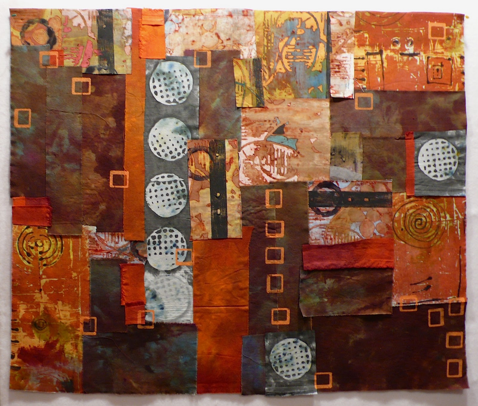
I put this together quite a while ago when I was going through one of my "I must work larger" phases (which I still haven't discredited but keep ignoring as I plod forward with new work).
After I printed the orange squares, I stalled. For many reasons. Here are a few:
1) I'm not sure I like the orange squares anymore. I don't know that they add anything. I could cover them with more fabric and it would be like they were never there but I don't know if I want to do that.
2) I don't think stitching will do anything good for this piece. I just don't think it needs it.
3) Its lacking a focal point. But does it need one? Could I just enjoy the colors and shapes and leave it as a soft abstract piece?
One thing this piece did teach me is that when I work larger like this I won't be working on felt. I don't like the stiffness it adds so I need to decide what the base layer will be but rolling this up and shipping it anywhere if it was ever accepted into a show? Wouldn't be much fun.
I'm feeling like I want to at least decide its fate. I'd kind of been thinking mean things about it when I first started digging through the layers tacked up on the board. I'd have off ideas about chopping it up into smaller pieces or tucking it away in a closet or printing the snot out of it.
But now I've no idea. After I tacked it up to take this picture, I felt an attraction to it again.
What would you do?
18 comments:
I like it. Have you tried looking at it rotated 180? I would add one of the white strainer things to the upper left and perhaps a touch of the deep orange in the top center. I think it really has a lot of visual interest. I also think it would be good cut up because it has strong elements throughout. Heck of a lot of help I am! Ah yes, the Craftsman style home. We have collected and inherited the furniture, now we need the house. LOL! They don't exist in our area. The town didn't exist before 1940! So, we'd have to move back to Seattle or Portland. I'm game, but hubby has never(or ever will)live in a wet climate. Sigh.
I like the orange squares, I think they tie the layers together well. The column of them is a strong focal point for me; I would consider adding something there to vary those squares somehow.
Perhaps print lightly darker squares offset over the orange squares. And you might ad a larger white ring thing in the bottom centerish. (Does it drive anyone else crazy that you can't just draw a little diagram?)
It looks good as is, but would also work cut up - and you might be happier about the felt that way.
I meant slightly darker - not lightly darker............
I vote for the orange squares. I think they add unifying movement through the piece. I don't think it needs anything else. I like it a lot. :0)
I wouldn't cut it ALL up, but I might judiciously trim off some of the bottom. To my eye, that is dragging down the vibrancy of the rest of the piece...and remember that everyone who looks at this will have a different perspective than yours! Maybe it need to go back up on the design wall for a while!
I like Kathy's idea, but I might take it one step further... trim off the bottom two inches or so, but don't discard it- bring it back to the top and and let it live there for a while before you decide if it helps, then stitch it down. I believe bringing some of the dark lower part to the top would really help to punctuate the lighter value fabrics.
I like the orange squares. I'd consider adding long lines of stitching (big stitches, big thread) in the same color; they might help guide the eye around...and beads never hurt anything...
If it were mine, I'd try a light outline of a large bird (or something) down in the lower left. That corner does seem to drag the rest of it down.
But I love it otherwise.
You didn't say how big it is. I've also run into the problem of doing a piece of fiber art and then not knowing what to do with it. I'm cropping a lot of my fiber work and mounting it onto wrapped canvases. Sometimes the fiber art is quilted and sometimes it isn't. I glue the fiber art to the canvas, let it dry, coat it with Mod Podge, and then paint the edges of the canvas. I've started donating a lot of these pieces as items for fund-raising, like at silent auctions. By the way, I, too, like the orange squares.
I also like the piece, the white strainer stamped row, does pull the eye,,,Thinking that you could cut into smaller pieces, use a cut matt to view the areas, you could adjust the viewing area to find the parts you like and make smaller pieces, or bind it and love it as it is..
I like the mounting on canvas, and am doing it lately for smaller pieces to hang in the gallery.
I would overprint on the orange squares to tone them down a bit, like Tawney said. I'd also like to see some focal point, a print of something with detailed lines, a place for my eye to go. I think it's a great start, I wouldn't cut it up, at least not yet.
I would chop it up and rearrange to pieces like a jigsaw explosion. Maybe even stick it back together completely differently and cut it up again several times just to break it down even more. I quite like the fact it's got no particular focus point and I would play with that and blur it even more until it became completely abstract and 'lost' within itself.
I like it but agree that the focal point is weak. I also thing that adding much more is not needed as it seems to have enough going on. When I can't figure out how to solve a design issue I usually cut it into smaller works or cut it up and rearrange it. I DON'T think you need this here though, just a focal point. My favorite fix for that is a dab of complimentary color - turquoise? Maybe fill in a couple of our orange squares with turquoise in the upper right quadrant (rule of 3rds) or add a turquoise 'something in that area. Don't give up on it, I like it!
I think the orange squares provide movement in the piece. I think you do have a focal point -- the vertical line of 4+ white, textured circles. My eyes are immediately drawn there. The other two circles, one on the right, one on the bottom, help pull my eye away from such a strong focal point, as well as balancing the piece. There are lots of varied textures in the piece, and the small orange squares act as a map, or trail, to encourage the eyes to move around and pause at the various textured pieces -- almost like the piece is its own gallery. I think beading could add additional movement to the piece, or some 3D elements, to help pull the texture toward the viewer. You might consider some hand-stitching -- not lots of it, but, again, to help bring focus and add texture, if you want to organize some of the areas, but subtly, to not stop the eye. I think some trapunto of the circles could be exciting and bring them out more -- or trapunto on some of the printed pieces where it's 'rough'; it will highlight the wonderful texture. Possibly some 3D paint on it? I don't recall if you said how large it is. I can see it mounted on driftwood or something organic -- but visible. Like, hanging from a branch or bark, using long pieces of bark to create a stretcher but large enough that it isn't hidden, possibly obviously nailed onto the bark? with the nails sticking out? Sorry for the long response, but I think it's an exciting piece.
Confused yet? Bottom line? We like it, but there's almost as many suggestions as there are little orange squares. (Which do add life and more of a focal point, but I thin there needs to be a bridge between the white strainers and the orange stacked squares.
I also like Kathy's suggestion of cutting off a bit of the bottom and putting it at the top to balance the weight....
I think it needs black and white stitching, especially to integrate the orange squares. And maybe black circles?
I think it might be a value problem--try looking at it in black and white and then maybe adjust the value pattern.
But I also like the idea above of a bit of turquoise, maybe stitching?
Post a Comment