30 April 2010

one third done


I've been pondering a lot lately. And in all honesty, its a lot of bickering with myself over things that make for pretty boring blogging so I decided to just sit and think and let the blog plod on without me.

Its also a little sobering to realize that since today is April 30, the year is one third over. That seemed to bolt by in a blink. I wish time came with a pause button...

But I've also been puttering at various things that are bloggable so I thought I'd do some random today.


The Eighth Wonder of the World


I told you I was cleaning my studio. See that? That there is the corner by my paint supplies? See the brown stuff? That is F-L-O-O-R. Haven't seen that in, well, longer then I care to admit to. I admired it for a while. Took a picture. I may make it the wallpaper on my laptop so that I can look back on it with fond memories. (I took this picture a week ago. It still looks like that. I heard tell there is a betting pool on how long it will remain that way. I caution those who have put in long term bets to reconsider...)


Now we're talking...

I went to Michael's today in search of some incredibly strong double sided tape and came home with this:


I was sold the moment I read the line that says "Aggressive permanent adhesive." I imagine it growling with fury if you try to separate whatever it is trying to hold together. Its like the ninja of the double sided tape family. The idea that it will be wickedly defensive of my artwork sent me into a hysterical giggle fit at the store. I think they were happy when I left.


Every day is Halloween...

Or at least it will be when I rule the world.

A while back I bought some cool halloween flannel prints and then realized I had no idea what to do with them. Mary said she could put them together and she did:


This will be one of those fluffy "rag" quilts. Apparently I have to wash it until it begs for mercy. I'm pretending not to notice that it got up to 75 degrees today. I plan to wash it (over and over until I hear whimpering coming from inside the washing machine) and use it. I refuse to acknowledge the warm weather when I have something this cool in my presence.


Speaking of...

I am not one of those knitters who abandons her wool and heads on over to lightweight cotton in the warmer months. I may sweat and curse as the yarn sticks to me while I knit, but I use wool all year round. Before I left for IQF I cast on for Multnomah (its a free pattern you can find in her right hand sidebar). Here's where I'm at with it:


Yarnhog started knitting it and I love a simple shawl that shows off yarn so I decided I needed to copy her. I also copied her plan to use larger yarn so that it would be bigger then what the pattern produces. I'm using Lorna Laces Shepherd Worsted in color Satsuma.

I adore orange. The variegation in this is beautiful.

The thing I really like about this shawl is that the body of it is simple garter so its nice and spongy and then the border gives it some nice personality. I'm done with the body and heading into the border. Of course, when I realized I'm at 229 stitches and am continuing to increase for another 40 rows...well...there was whining involved. But I'll finish it, its too pretty to let it join the ranks of unfinished projects.


In the studio

I've been working on several things but I can't show you because I'm hoping they'll land on some magazine pages in the near future.

But I did finish the art journal I started way back in this post so here are a few shots (I left the photos larger then I normally do so click on them if you want to see bigger images):


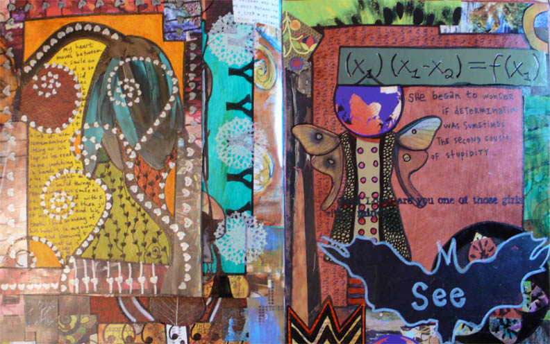
I'm a complete border addict. In fact, if I'm not careful, I can fill half of a page with just border after border after border after border...they are like little addictive rows of collage goodness. And since I like to make the pages in my art journals different sizes, things like this make me stupid happy:


Just a chaotic little pile of edges of pages and tons of borders. *sigh* Heaven...


Reading

I was lamenting to Mary yesterday that I can't seem to find any good books to read lately. I think what's happened is that I've been reading the same authors for a few years now and I need to find a couple new-to-me writers. She suggested this book:


I'm really diggin' it so far. I'm already fifty pages into it and I have a feeling it won't take long to finish it. A good book is the perfect addition to the incredible weather we had today. I love being able to open up the house and let all the breezes in. Dooley love appreciates it as well, always opting to nap belly up in front of an open window. Its not exactly graceful to look at but he enjoys it so its all good.


Plymouth is having its third annual Green Street Fair this weekend. Its all about recycling and organic and I'm hoping to go tomorrow. Its getting better every year with more art booths and activities. I saw a clip on the news this evening of a woman who sells bubbles for your pets that are flavored. The one she talked about was salmon flavored. Seems odd but I think little man would go nuts for it, especially if she has a chicken flavor. I'll have to check that out and see if we can get him some fun.


25 April 2010

where i stand sunday


Chicago scrapes along in a frenzied hurry, 110 stories below my feet. A clear platform juts out from the side of one of the world's tallest buildings. The step out into nothing made my breath stutter, a strange sort of tentative awe settling in. Looking down on the breadth of the buildings huddled together along the water's edge feels surreal.


Where I Stand is an ongoing photo essay examining the different places I spend my life standing. Too often we take for granted the everyday places we spend our lives walking on. The ground we tread on has its own stories to tell. (The project is now in Year Three. Year Three will feature artwork inspired by that week's Where I Stand photo as well as the photo that inspired it. Year One and Year Two can be found here.)


INSPIRED BY ARTWORK TECHNIQUE: digital manipulation


Original photo:

22 April 2010

top ten questions

I'm still recouping from IQF. I promised myself that I would tidy my studio when I returned from festival before I started another project.

Yeah, well. I work on tidying and then I shove everything around into a heap so I can make something. Talk about a counterproductive heap of silliness.

At any rate, I came away from Open Studios and the show with tons of ideas and directions I'd like to go. I also got asked several recurring questions during Open Studios so I thought I'd distract you with a post answering them while I work on getting back into the groove of things:


(this is the only decent picture I took during open studios...if you have one that you wouldn't mind sharing, please email it along to me. thanks!)

Q1: What is a thermofax screen?

A1: Excellent question. A thermofax screen is made from a thermofax machine which is a giant hulk of old technology that, in its hayday, was considered very advanced technology. Of course, now that we can carry around an entire computer in our shirt pocket, its considered by most a relic that is best used as a doorstop.

The screen is made by passing screen mesh and a photocopy of a black and white image through the machine. The heat in the machine burns away the parts of the mesh where there is black on the image and voila, you have a screen.

Finding the machines are difficult. And can be expensive if you go to a place that refurbishes one. But if you do come across one at a reasonable price, snatch that bad boy up, its a gem.

This is what mine looks like:


Not real pretty but I have an undying affection for it. (I may have even named it Henry but that could make me sound like a nuts-0 so we'll leave that to speculation.)

The screens last a long long long long long long time (I have some that are several years old) and provide repeatable consistent results.

Tattoo and fiber artists seem to be the biggest users of it at the moment. Will they begin making them again? No idea. Odds are no. But I suppose we could stage a march on 3M and demand they bring them back. If nothing else, it would be entertaining.

**************************************************
Q2: Why do you use foam brushes?

A2: The most honest answer I have for you is that I'm a brute when I use a squeegee. For whatever reason, the moment you put a squeegee in my hand, I turn into the hulk and decide that I must use as much force and pressure as I can. (Works well during deconstructed screen printing but its not always necessary.)

The foam brushes force me to be nice to the thermofax screens. Plus they double up as a way to help wash the paint off the screen.

**************************************************

Q3: Why do you duct tape the edges of the screens?

A3: You can buy frames for thermofax screens. My thing is that I like to make lots of screens. I have to mail order frames (that whole waiting around thing is so irritating sometimes) and a roll of duct tape is so much nicer to my pocket book.

Plus they come in funky colors now. No more boring run of the mill silver - get yourself some red, neon and even fancy pants prints now.

You have to either duct tape or put a frame on the edges of the screens. The edges fray otherwise. Plus it helps them lay flat.

**************************************************

Q4: Do you use a padded print surface?

A4: Not always. I normally print on a regular table but I do put a piece of denim beneath the fabric I'm printing. I dream of the day I can set up a permanent print table but since space dictates otherwise, I make do and have been satisfied with the result.

If you want to set up a temporary print surface, here's what I do. Take two to three layers of acrylic felt (cheap-o stuff from Joann's that's 72" wide is what I normally use) and tape them down to your table. Then tape a piece of plastic over the top of them (I usually use a garbage bag that is cut open). I still place a piece of fabric over the plastic so that the paint will be absorbed into the fabric and not slip around on the plastic waiting for my next new piece of fabric to get mucked up.

**************************************************

Q5: Do you sell the screens?

A5: I will be selling them very shortly. My goal is to have a little etsy shop up by June 1 that will sell screens with designs already burned into them ready to go as well as being able to print screens with your own images.

I'm working with three artists right now that will sell their designs in the store. I will also have a PDF available for sale that explains how to use the screen. I'll be starting out with a beginning printing one and then working on making one for printing with things other then paint.

There will be a big party on the blog announcing when its ready to go - and another screen giveaway.

If you are interested in selling some designs in the shop, email me at FibraArtysta@earthlink.net for information on this.

**************************************************

Q6: Do you teach?

A6: I am currently working on workshop descriptions for two classes: Printing with Thermofax Screens (one for printing with paint and one for printing with other mediums) and Art Journals.

Again, I'll be announcing them on the blog when they are ready to go.

**************************************************

Q7: What is your favorite kind of paint to print with?

A7: This is a wide open question. Its sort of like asking someone what they favorite song is, everyone has a preference and opinion.

I've tried a lot of different brands but I can tell you which one I reach for over and over is Plaid brand Simply Screen. I use them the most for four reasons: (1) they have good opacity so they work well for my work, (2) they are economical at $2.99 a bottle (3) I can get them at local stores, I don't have to mail order them and (4) I love that they come in a squeeze bottle that lets me aim where I apply the paint and the paint is a good consistency so its easy to squeeze out of the bottle.


I dig it, what can I say? There are tons of brands out there and I encourage you to try them out so you can be happy with your results. But give the Simply Screen a try as well, its cool stuff.

**************************************************

Q8: Can you only screen print on fabric?

A8: I will screen print on anything that will hold still. (Dooley sometimes looks worried when he sees the brush in my hand.)

Some brands have different paint for different surfaces (speedball does this) but I use the same paint on both paper and fabric. I do find that I need to go a little easier on the amount of paint when doing it on paper when you are doing it in an art journal.

Experiment with it. Don't fear the paint. Worst thing that can happen is it doesn't work out the way you wanted it to and really, that's no big loss.

**************************************************

Q9: What kind of paper do you use for your art journals?


A9: Watercolor papers. Holds up to all the torture of the paints and markers. I do find it curls a little bit after I paint the pages but I weight them with some heavy books overnight and they behave just fine.

Cold press watercolor paper has texture and hot press watercolor paper is smooth like computer paper. I like to buy the large sheets (I believe they are 22" x 36") so I can make whatever size and shape of pages I like.

**************************************************

Q10: What kind of paint do you use to paint the backgrounds of the pages in your art journal?

A10: I've done several different ways of doing this. I've watered down Golden paints to a wash and its worked pretty well. But lately I've been going straight for watercolor paints because they give the wash easily and I don't have to do much.

To make matters even easier, I discovered that Dick Blick sells liquid watercolors. They come in big 8oz bottles and the pigment in them is great. They are squeeze bottles but all I do is tip them upside down and drip a couple drops onto the paper and spread it around. I find I use less paint this way and the size of the bottle means I'm going to get a lot of journals out of them.

**************************************************

Wow, lots of babbling. I'm wandering back up to the studio to do some more cleaning. The westie is at the groomer's getting his summer hair cut which means it will probably snow tomorrow. But he needs it, he's been huffing and puffing lately when the weather warms up and its only gotten into the 60s so far.

Send a search party if the blog goes dark for too long, the studio may have absorbed me into the black hole of its chaos (which may not necessarily be a bad thing)...

a little earth love


Like many bloggers/artists out there, I draw a great deal of inspiration from nature. Mostly I am drawn to the color palettes that mother nature has (she's one lucky gal) and the constant change that always results in beautiful compositions.

I wish you all a happy Earth Day and hope that you too find your surroundings inspiring and full of suprises.

20 April 2010

b l o o m s


The tree that was covered in buds in this post is now in full bloom.

I was only gone for four days at IQF but all the plants have had a party while I was away, all in bloom and growing like mad.

19 April 2010

stick a fork in me

This weekend was fantastic in every way possible. One of my most favorite things about IQF is meeting online friends in person and seeing other artists that I really wish I could see more often - it sort of turns into a little reunion.

The only thing I don't like is how quickly it flies by. I've got much to share but I think I might need to sleep for a couple days to regain some of the energy I used up this past weekend.

And, in classic dork fashion, I did not get as many photos as I would have liked, including Open Studios. *sigh*

Bear with me, I'll be back talking your ear off in no time.

18 April 2010

where i stand sunday


this is where i belong
amongst layers of fabrics and crowds of artists
my mind finds ease in this home


Where I Stand is an ongoing photo essay examining the different places I spend my life standing. Too often we take for granted the everyday places we spend our lives walking on. The ground we tread on has its own stories to tell. (The project is now in Year Three. Year Three will feature artwork inspired by that week's Where I Stand photo as well as the photo that inspired it. Year One and Year Two can be found here.)


INSPIRED BY ARTWORK TECHNIQUE: digital manipulation


Original photo:


13 April 2010

squeegee vs. sponge brush

Next up on things to talk about with thermofax printing is what to print with: a squeegee or a sponge brush.

I think its pretty obvious from this picture which one I prefer (that squeegee is far too clean):


I do use squeegees when I print with these kinds of screens. Its my go to tool for deconstructed screen printing and other kinds of printing. But my preference for thermofax screens is a sponge brush.

After several times of printing with a sponge brush and having almost as much paint on my hands as on the screen, I did a little modification on the brush. You can see the difference here:


There is a cardboard insert in these brushes that give it its stability. But it stops short where the brush forms the chisel end. This makes the end of the brush nice and bendy. While that works well for a lot of other things, I wanted a little more pressure then it offered. (I used to just push on it with my finger as I printed to get that pressure which is why it got so messy.) So I simply chopped off the very end of it and use the part that is fully supported by the cardboard.


Super easy. The thing you have to remember, though, is that the cardboard that's left in the brush is now exposed and you have to be careful not to scrape it across the screen. (I'll talk about printing in another post.) But its a really stable brush now and easy to print with.

Plus the sponge brushes are really economical and easily replaced. Always a bonus.

You may end up with a mountain of these:


I hang on to these to use for direct stamping on fabric. They work really well, you can cut little shapes into them or just do rectangles.

I leave for IQF in two days. If you are attending the show, please stop by the Cloth Paper Scissors area and see me during Open Studios on Saturday morning from 10:30-12:30. Hope to see you there!

12 April 2010

and the winner IS!


The handy dandy Random Number Generator picked comment #16 as the winner of the Mama & Baby Bird thermofax screen.

Congratulations to Susan A!

Email me (FibraArtysta@earthlink.net) your address and I will get your screen out to you pronto!

Thanks to everyone for leaving a comment. I'm working on a little something that will offer several original thermofax screen designs for sale. More info to come after I get back from IQF so be sure to hang around the blog for more details.

Thanks! :)

11 April 2010

the wash test


Yesterday I decided heat set and do a wash test on the paints that I tried out a couple of days ago. They are (in clockwise direction) Plaid Simply Screen, Yudu, Jacquard, and Createx.

It was largely uneventful.

(The photo of the red piece isn't showing up well but the paint didn't change, my camera is giving me fits.)

Only the Plaid brand said to hand wash the fabric, none of the others gave any specification on how to go about it. But honestly? I wanted to see how tough these guys really were so I decided to toss them in the washer.

Granted, I did put them on the delicate cycle on cold water so they didn't get beat up too bad but I wanted to see if machine washing was a possibility. And I should mention that I have a top loading washer so the agitator, even on the delicate cycle, does give things a good workout.

I didn't notice any fading or chipping on any of the samples. Which sort of surprised me. I was sure the Plaid brand was going to go down in flames since it was so inexpensive but it definitely held its own.

It appears that they all hold up well to washing.

I'm going to do a few more blog posts on how I print with thermofax screens. Pretty much what I'll be doing in Open Studios is what I'll put up here and I'll do it in separate posts so as not to cause anyone to nod off.

More soon...

where i stand sunday


The building is stuffed full to capacity with homeless objects available for a new life. The pull to use things up rather then starting over is evident in this place. Everything waits for someone to take a second look, to see a faint possibility.


Where I Stand is an ongoing photo essay examining the different places I spend my life standing. Too often we take for granted the everyday places we spend our lives walking on. The ground we tread on has its own stories to tell. (The project is now in Year Three. Year Three will feature artwork inspired by that week's Where I Stand photo as well as the photo that inspired it. Year One and Year Two can be found here.)


INSPIRED BY ARTWORK TECHNIQUE: digital manipulation


Original photo:

10 April 2010

creek, buds and sunlight


I took a break from the studio today and spent some time outside. This is the creek that runs along the side of my house. It looked like crystal in the sunlight. Despite the cold weather here, everything continues to bud and turn green.

08 April 2010

mama & baby bird thermofax giveaway


I'm totally geeked about Open Studios and am having such a fun time printing fabric that I thought you should too!

So I'm doing a little giveaway for a thermofax screen that can print the image that you see above, the mama and baby bird. (The screen has the image to print one of them, not three of them. The fabric above was printed three times. The giveaway is for the screen so you can print your own fabric, not for the fabric shown.)

You'll get the screen with the edges taped off with duct tape a little instruction sheet on how to print and care for it.

All you've gotta do is leave a comment on this post and you'll be in the running. (Anonymous comments will not be counted, sorry. I have no way to contact you if you leave one that way.)

I'll pick a winner with the random number generator on Monday April 12 so you have until then to be in the running!

07 April 2010

battle of the paint brands

Open Studios for IQF is fast approaching (next week in fact) and I realized a couple of days ago that most of my screen printed fabric has been cut up and consumed by projects. While that's a good thing from a portfolio viewpoint, it doesn't create that impressive of a demo.

Imagine going to see a demo and the artist pulls a pile of scraps out, dumps them on the table and says, "Aren't they great?!"

Yeah. Not so impressive.

So its time to get my behind moving and get more samples printed up. I was also thinking that I would do some blog posts about what I'm demoing at Open Studios, which is screen printing with thermofax screens. Sort of like the demo in little bitty installments without the entertainment of me flinging paint about in an anxious frenzy.

One thing I really wanted to do was take along comparisons of screen printing paint brands. There are more options now then even just a year or two ago.

I printed with four paints today and two came out as my favorites. These are my personal opinions and you can take them or blow 'em off, won't hurt my feelings.

Here are the brands that I tested today:


From left to right: Yudu, Plaid Simply Screen, Createx and Jacquard Neopaque.

Here are the things that I look for in a screen printing paint: (1) decent cost (this includes taking discount coupons into account), (2) availability (do I have to mail order it or can I go to the store and pick it up?), (3) how opaque is it (I torture test samples with light paint on bright or dark backgrounds) and (4) range of colors.

All of the images of the prints are of the paint dry. This is important because just like wall paint, the colors aren't always as vibrant or opaque once they dry.


First up was the Yudu brand:


This is the color Putty on black. (All the prints are on Kona cotton.) Here are the answers to the questions above:

(1) Retail cost is $7.50 for 3 oz. You can get this brand at Joann's so it makes the price reasonable - drops the price to $4.50 if you have a 40% coupon. They also come in three packs of colors so it is even cheaper this way with the coupon.

(2) I can get this at local stores.

(3) Its got good opacity.

(4) They have a good range of colors including earth tones and neutrals.

I really like the squeeze bottles on these. The paint is a good thickness although I did end up adding a little bit of water to some of the bottles to thin it out slightly.

The paint also washed out of my screens easily.


*************************************************

Next up is Plaid Simply Screen paint (slightly lousy photo, my apologies):


This is Apple-tini on turquoise fabric.

(1) Again, you can get this at Joann's so with a 40% coupon, which makes it all kind of convenient.

(2) Can get it locally at stores.

(3) It has pretty good opacity. The color shifted a little on the fabric (its a lime green in the bottle) but I can't say I'm bothered by it. It performed pretty well for having to contend with such a strong colored background.

(4) In terms of colors, they lean more toward primaries and brights. They do have a couple metallics but really lack in the neutral color range.

This one also comes in a squeeze bottle and I really really like this. For the way that I print (I'll do another post on this soon), I find it really helpful to have the squeeze bottle (I end up wearing less paint).

It also cleaned up well, didn't clog the screen at all.


*************************************************

Next is Jacquard Neopaque paint:


This is turquoise on yellow fabric.

1) Retail cost is $5.29 for a 2.25 oz. bottle. Again, this can be purchased at Joann's now so the price drops to about $3.17 with a coupon.

2) Can be bought in a local store.

3) The opacity is very good. Jacquard has very heavy pigment and rich color.

4) They have a decent color range as well. More metallics then the previous two if that's your thing.

Let me preface this next statement by saying that I love Jacquard paint. I think its excellent. I do it for direct application printing all the time and for that, its my absolute favorite. But for screen printing? It has a tendency to do this to my screens:


That's the screen after its been washed out. This is not the first time it has stained one of my screens. For that reason, it falls toward the bottom of my list for screen printing. The color doesn't rub off on the next print but it bugs me enough to avoid it for this particular thing.

*************************************************

And lastly is Createx paint:


This is hansa yellow on red fabric.

1) Cost is $6.88 for 8 oz. I can find it discounted for $5.63. So if you compare how many ounces you get for the price, Createx is a great deal.

2) I've never been able to find it locally. I have to mail order it which sort of makes it a pain. For one thing, I like being able to get what I need when I need it and not have to wait for it to ship. And secondly, when you want to order several colors, the shipping costs really add up so it sort of kills point #1.

3) The opacity can be weak with certain colors, such as the yellow above. This is NOT true for all createx paint, just certain ones. Which means when you first buy it and are experimenting, you could end up with a jar that you just don't have much use for (I tend to work darker so paint that absorbs into the richer colors is useless to me, which I would expect it would be to most people).

4) They have an o.k. color range. I know I can mix colors to get a particular shade but a lot of times I want repeatable consistency and unless I plan to keep a notebook of one-part-this-two-parts-that, I like a decent range of colors to pick from.

This paint cleans up well, no problem-o with the washout on the screens.


Wow, what a mouthful. I suspect the only ones who made it to the bottom of this post are other people who want to print fabric. Everyone else probably nodded off and has bumped their heads against their monitors.

Sorry 'bout that one.

For me, my favorite brands to work with are Yudu and Plaid. I'll be keeping those as my go-to paints in my studio. Again, not gospel, just my personal preference.

I don't really feel like it would be a fair review without washing these. I admit that I almost never wash my printed fabric since it usually ends up in wall art. But I'm wondering if I'll notice a difference in the performance of the paint once its been washed (Plaid - I'm looking at you). I'll let them sit for a day while I putter with other things, heat set them and then give them a hand wash and let you know how that goes (with much less text, I promise).

Okay, I'm all talked out. I'm going to post a giveaway tomorrow so more screen printing frenzy to follow...

06 April 2010

b u d s


I promised myself that when I started the 365 Happy Things Project that I wouldn't post the same pictures there and here. (Its been a little bit of a challenge but so far so good.)

But this time I can't resist.

This is the tree right next to my garage and I've always regarded it as a marker for the seasons. Its a flowering tree so the show in the springtime is really impressive.

Here it is stuffed full of buds against a crisp blue sky. Soon it'll be covered in flowers.

05 April 2010

the imperfect print

Here is possibly one of the most dangerous statements in the world: "I'm just running in to Joann's for a couple of things."

Right.

I tend to use Joann Fabrics to buy my basics. Most everything else I have my favorite spots to buy from, being a firm believer in keeping the independent businesses humming. I had two things on my list when I went in there: sponge brushes and some linen type fabric (to be bought with a lovely 50% off coupon.)

Well, they beat me to it. Nearly everything in the store is on sale. Plus they are carrying two screen printing inks I've not tried yet. Had to sample those. And nearly all the fabric that I favor (meaning undyed organic wooly salt-of-the-earth looking stuff) was 50% off. I guess it pays to buy the warmer wooly fabrics in the spring/summer.

I came home with this:


The brighter colored paint is by Tulip brand paints. They are the cheapest of the lot at $2.99. The squeeze bottles are Yudu and far more expensive at about $8 a bottle. (All on sale. Damn sales.) Up until now I've only done screenprinting with Jacquard and Createx paints. Both of which I've been totally satisfied with but I always have to try out new-to-me brands. Never know what you are going to find.

Oh! Oh! And here's the best thing of all!!!!!!

My work table has arrived! (Yes, it warrants that many exclamation points!!!!!!) ! It has wheels, the sides are collapsible and for once, my short stature is coming in handy as its the perfect height for me to stand at and work. It makes me stupid happy.

I've had the idea in the back of my mind for a while about wanting to develop my own images to print my own fabric. My sketch book is crammed full of graphic doodles and I decided to make a few screens and see how they translated on fabric.

I'm pretty happy with the results:


I'm a fan of the imperfect print. I like it when things are uneven. It shows its handmade. The fabric I printed on today is a denim and the texture in the fabric made the edges a little wonky. I'll still use it but I probably won't buy it again.

I have some osnaburg fabric and some linen too that I want to try. Probably my best results will come from smooth cotton but I still want to give it a shot.

I'm going to draw a few more images and print with those. Its really fun to see them come to life like this and I'm totally hooked. My ultimate goal is to get a good range of images and sell some of the printed fabric. We'll see how it goes.

Tomorrow I'm going out scavenging tomorrow at some recycling centers. Should be a good time, never know what you'll find.

04 April 2010

where i stand sunday


small sighs of growth

yellow blots out the resting season

soft earth hungry for growth

embracing the new beginning


Where I Stand is an ongoing photo essay examining the different places I spend my life standing. Too often we take for granted the everyday places we spend our lives walking on. The ground we tread on has its own stories to tell. (The project is now in Year Three. Year Three will feature artwork inspired by that week's Where I Stand photo as well as the photo that inspired it. Year One and Year Two can be found here.)


INSPIRED BY ARTWORK TECHNIQUE: digital manipulation


Original photo:

03 April 2010

chocolate and wool


Does it get any better then that?

I was commenting to mom yesterday that its unfortunate that easter baskets disappear as you get older. But instead of ten pounds of sugar, wouldn't it be great if it contained items from your favorite hobby? Like wool...

I decided that even though I'm not a kid anymore, I sort of missed marking the beginning of spring with a special treat. So off I went to my local yarn store, Michigan Custom Boutique and Fine Yarns, and indulged in some just-for-the-heck-of-it browsing. I didn't come away empty handed (big shocker):


I was happy to find this book, 200 Stitch Patterns for Baby Blankets. I think the title is misleading. Yeah, a lot of things can be used for baby blankets but you could use them for a lot of other things as well. I'm trying my hand at putting together my own stitch combinations to make some simple scarves and this book has a lot of patterns in it that I'm really attracted to. They lean toward the lacey side of things and has both knit and crochet in it. Always a bonus for me.

The lovely lady working the store today introduced me to Poems yarn. It took all of twenty seconds to decided to pick up a skein of it, really beautiful stuff.

While I was walking back from the yarn store I passed a chocolate shop and decided to pick up one of the bunnies hanging out in the window. He gained an admirer while I was taking his picture:


Don't worry, little man has never gotten his paws on chocolate (although he sings sweetly to it, forever hopeful). He gave me a pouty face when I snatched it away but I gave him one of his cookies and all was easily forgiven.

I've always thought that this time of year should be the beginning of the new year rather then January. So many holidays at one time, budding trees, blooming flowers - everything just feels new.

However you are marking this time of year, I wish you a happy one!

01 April 2010

a sunny cemetery day

The move is done. Things are arranged perfectly and I managed to come out the other side of it with some of my sanity left. I still have to put much of it back together but the hard part is over and I'm puffing out a gigantic sigh of relief.

Add to that the fact that temperatures here climbed up into the mid seventies today and I was feeling pretty energetic. I asked Leann (a fellow skully cemetery loving friend) a few weeks ago (when there was still snow on the ground) if she would be interested in doing some grave rubbings. I expected no other answer then what I got (a resounding yes) and then we decided that we liked our fingers and toes so we would wait for the snow to go away and then go cemetery tromping.

Today turned out to be that day. I've been looking around on the internet for polite ways to do grave rubbings (I didn't want to do anything that would damage them), found some good advice and packed up my supplies:


Most of the suggestions I found online were for paper rubbings but I wanted to do fabric. The biggest things to remember are to (1) don't use any kind of adhesive to attach your material to the headstone because it can damage the stone and (2) don't use any kind of paint or pencil that can leave marks on the stone.

In other words, be careful and don't alter anything. No problem.

Plymouth is full of historical cemeteries. I'm quite fond of the carvings from the stones from the 1800s and there are plenty to pick from around here. I've got many photos on my flickr site. We visited two cemeteries today and had pretty good luck.

At the first one we visited, I headed straight over to a stone that, for whatever reason, I am quite fond of. I'd like to introduce you to Emma:


I like her so much and I can't really say why for sure but there is just something about her stone that fascinates me. (I even use the hand portion as the avatar on my flickr page.)

Its interesting to note that on most of the women's stones from the 1800s, their last name does not appear. They are normally buried next to their husbands or fathers. If she is married, her husband's name appears on her stone and that's how you know her last name. If she is unmarried, then her father's name appears. I find it sad in a way.

The other thing I really enjoy about these old stones is that all the carvings have meanings. (Here's a good site with photos.) There are a lot of sites that have lengthy listings but I can't find what Emma's carvings mean. A hand pointing downward means the hand of God descending from heaven but this hand doesn't really point, it looks more like its reaching for the flowers. I'll have to keep searching.

The rubbing of Emma's stone came out fairly well. I also have a thermofax screen of the hand portion of her stone so I'm hoping I can combine that to finish out the fabric and make a stitched piece out of it.

I did two other rubbings in Emma's cemetery. Here is Eliza:


Eliza's stone is broken and on the ground. Again, I can't find a meaning for her carving but I'll keep looking. Since I can't really read the writing on the second half of the stone where it broke, I'm not entirely sure what her last name was. I know she was married because it says "wife of" but the crack is right over her husband's name so that part is lost. The rubbing didn't come out perfect (there were lots of bumps) but I think I'll be able to use it for something to honor her.


And here is an unknown:


Part of this stone has sunk into the ground so I'm not sure what the name is. But the willow tree symbolizes grief. Many of the stones in this cemetery have toppled over or sunk so it make things a little difficult to really read them. But its now under the care of the historical society so things are being maintained.

We moved on to another cemetery after a little bit where we found a stone with markings neither of us had seen before. Here is Sophia's stone:


Her husband's stone had identical carvings. The winged hourglass means swift passage in earthly time. I'm not sure about the chain. I found a couple references to a fraternal organization where a chain is shown and the letters of the organization are in them but those letters weren't on Sophia's marker, maybe they were on her husband's and we just didn't notice.

At any rate, the rubbing from her stone didn't work out well at all. Here is Leann giving it a shot:


Don't you just love her blue hair? (That tape that is helping hold up the fabric is masking tape. Trust me, it didn't do any harm. It kept popping off the stone the adhesive was so low but it was better then nothing.)

I did one last rubbing before we called it a day. Here is John's stone:


This is the only stone of a man's that I did. He was a pretty old guy when he died, 76. Most of te stones I've seen from the 1800s show ages from 20-45 so John did pretty good.

I'm thinking about doing a series of women's stones. I want to honor them, give them their last names. There are several more historical cemeteries around to visit.

I know it may sound a little morbid to some but its really not. There is a strong historical connection. We saw many stones that identified wars that people had fought in and family plots that span many generations. Its a lovely tribute.

I've got a lot brewing in the studio right now (beside the mess) so it will be a little while before I get to Emma's piece but I'll get there. I've moved things around enough to be able to keep plugging away. I've got lots to do to get ready for Open Studios at IQF in a couple of weeks. So the blog will be hopping again. About time, right? :)